THE PANTRY
The Pantry
Campus Food Bank Rebrand
Graphics • Campaign • Rebranding
CREDIT
© Studio: Creative Media 2019
Designers: Timothea Wang, Alex Ryo Shimotake, Jiwon Choi, Michelle Gore, Joyce Kim
MY ROLE
Branding, Visual Identity, Campaign Posters, Graphic Illustration
Background
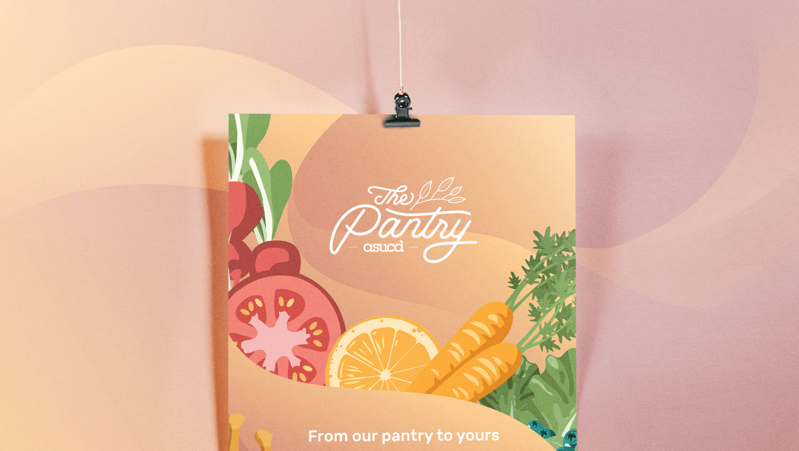
The ASUCD Pantry is a student resource that provides free food for students to fight food insecurity. Our design team at Creative Media established a rebrand for the grand opening of the newly relocated ASUCD Pantry, which was previously located in the building basement.
Our task was to turn this important, yet incredibly underutilized resource, into a centerpiece of the campus. In order to do that, we needed to create a cohesive brand that would be more accessible and inviting to all students.
Graphics
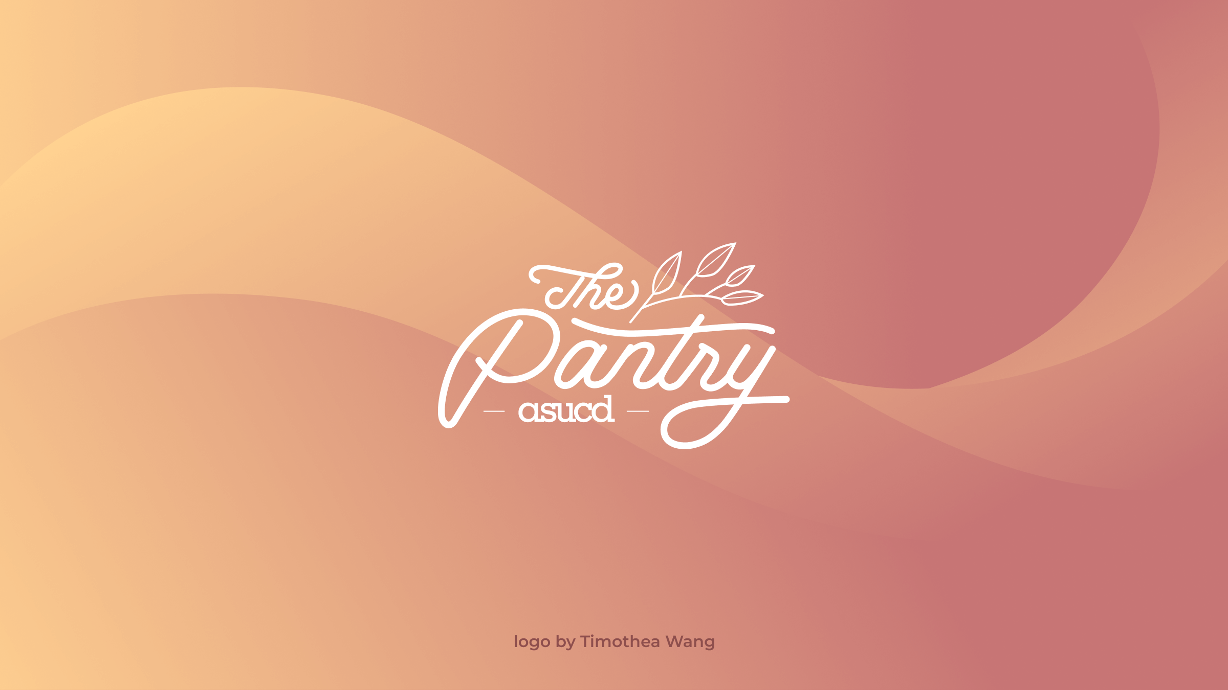
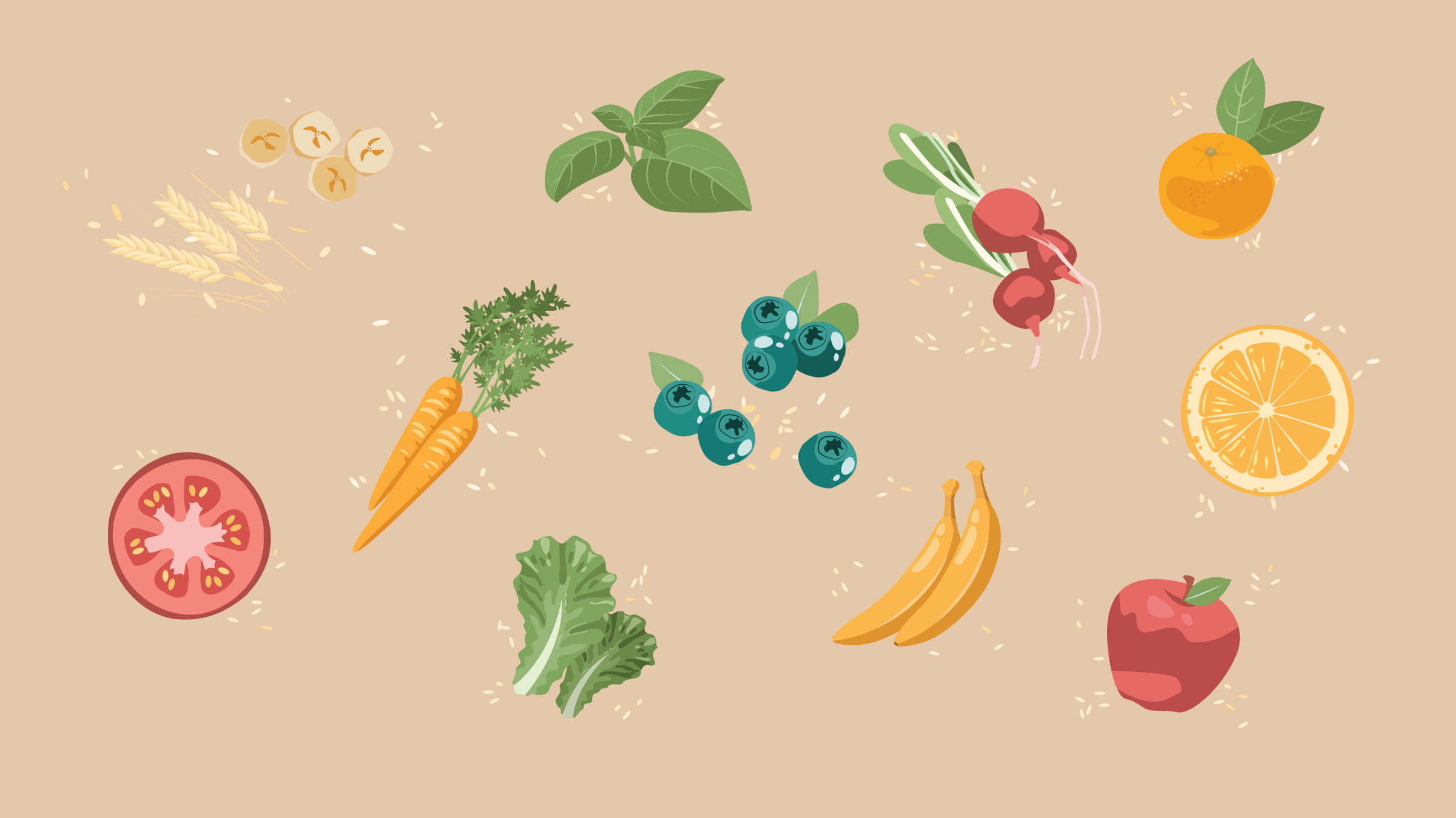
Our goal with the graphics in this project was to create a strong visual identity that would communicate freshness – for fresh produce and a fresh location. In order to achieve this, we worked together to create consistent visual graphics and visual elements that would be used throughout the material.
One of the challenges we faced was maintaining visual consistency throughout the work of all our designers. We resolved this by constantly cross-referencing our work and utilizing similar graphic techniques to keep a consistent aesthetic.




Materials
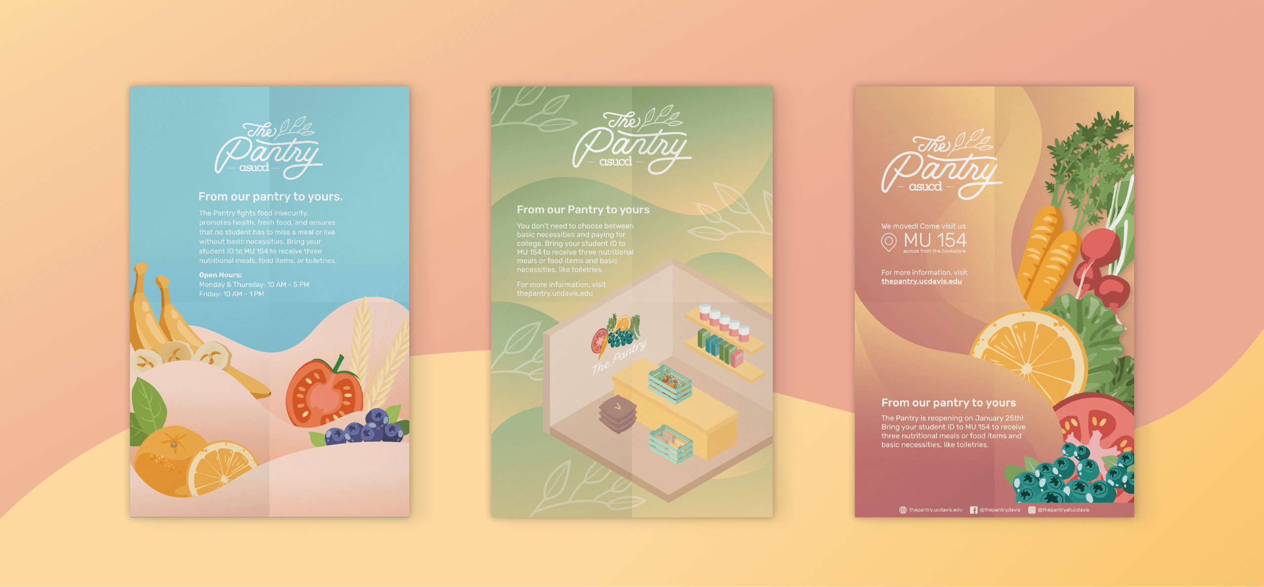
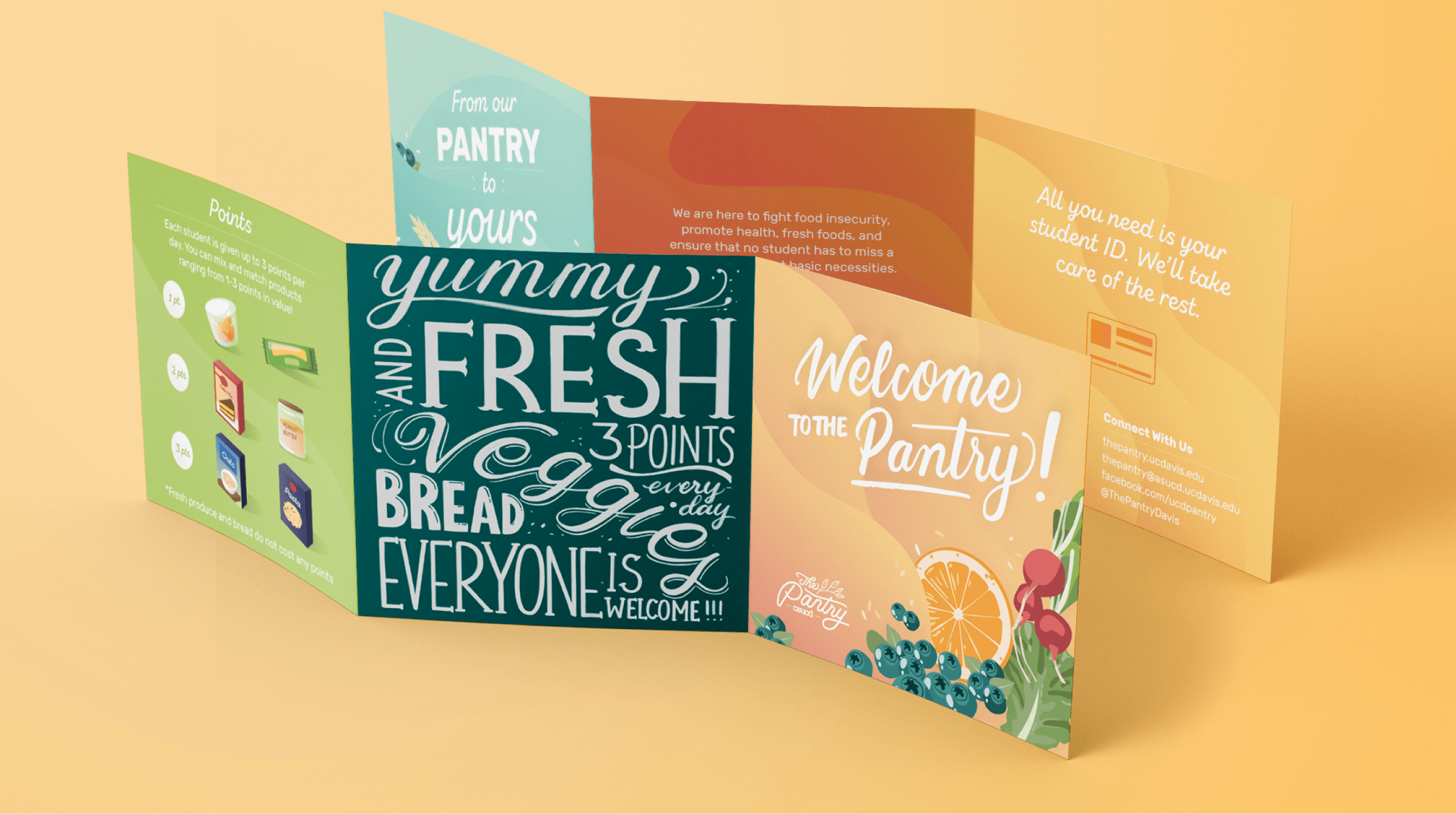
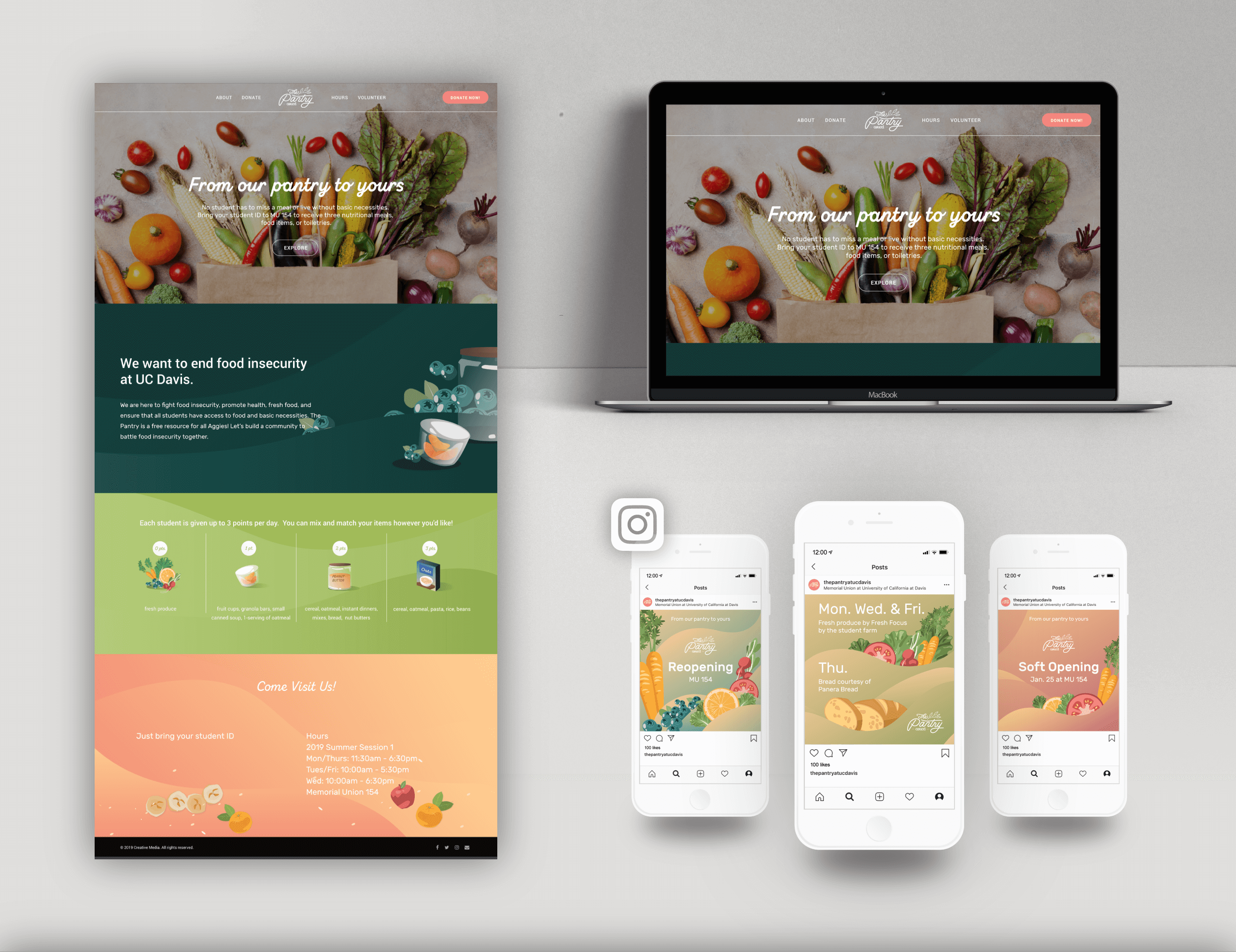
We created various material deliverables to promo the relocation and reopening of The Pantry, as well as deliverables to explain how the pantry operates. This included poster campaigns, signage, brochures, social media marketing campaign materials, and a redesigned website.
The Space
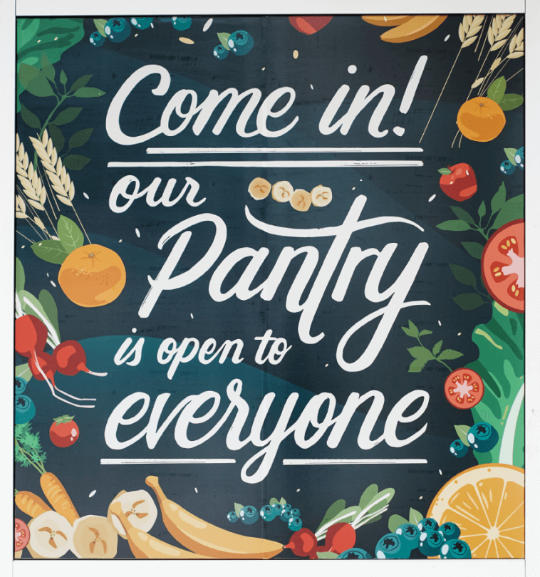
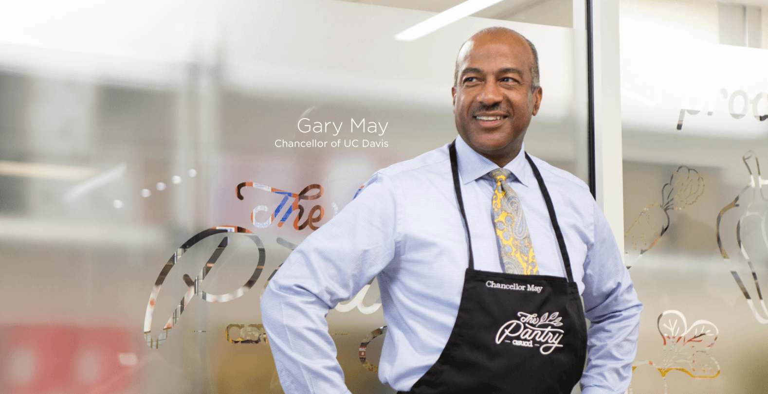
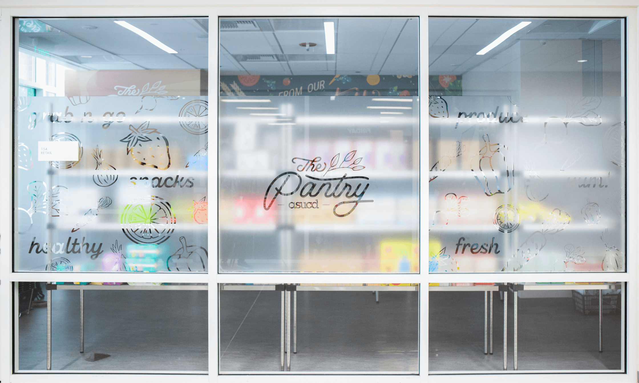
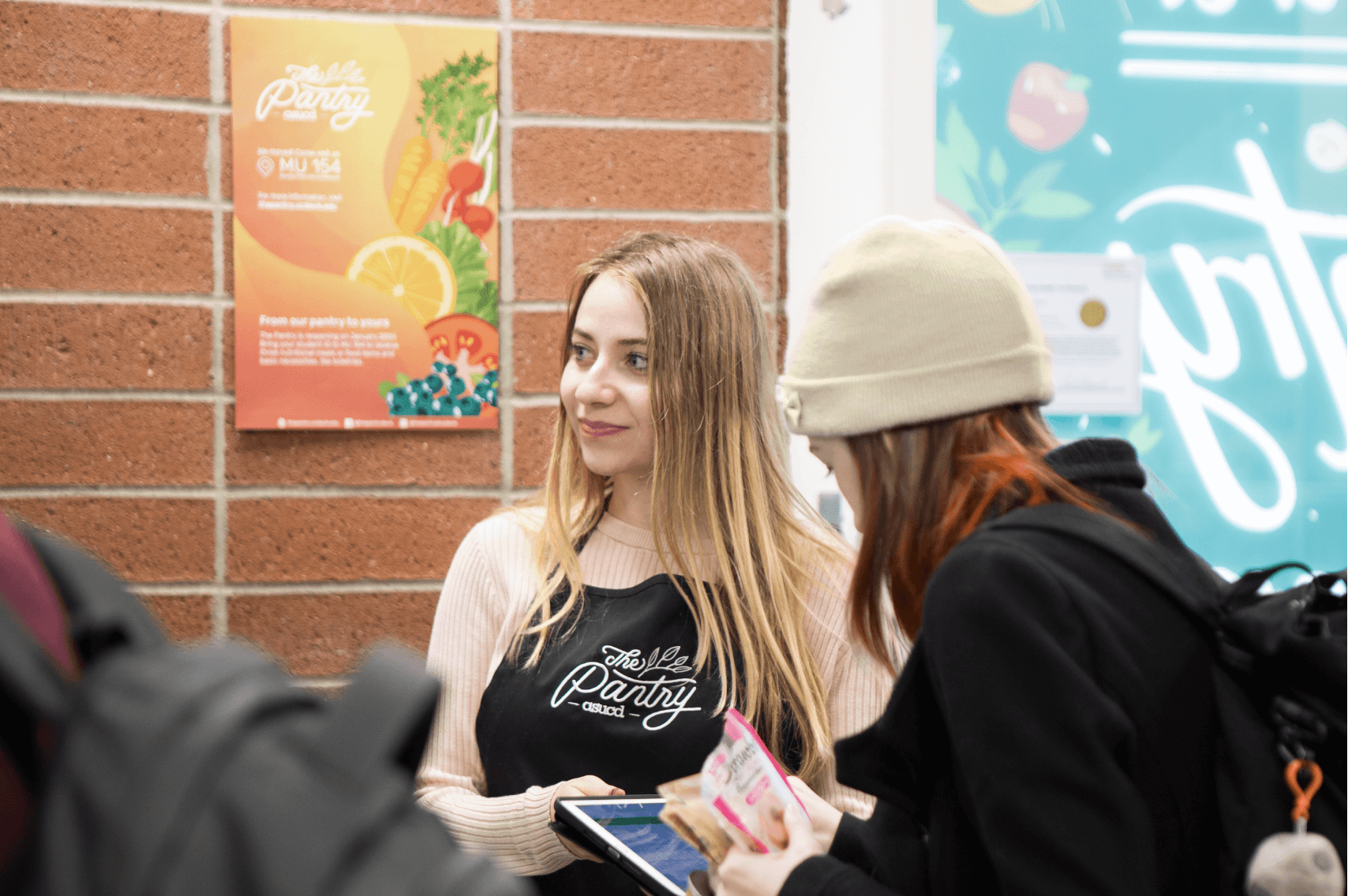
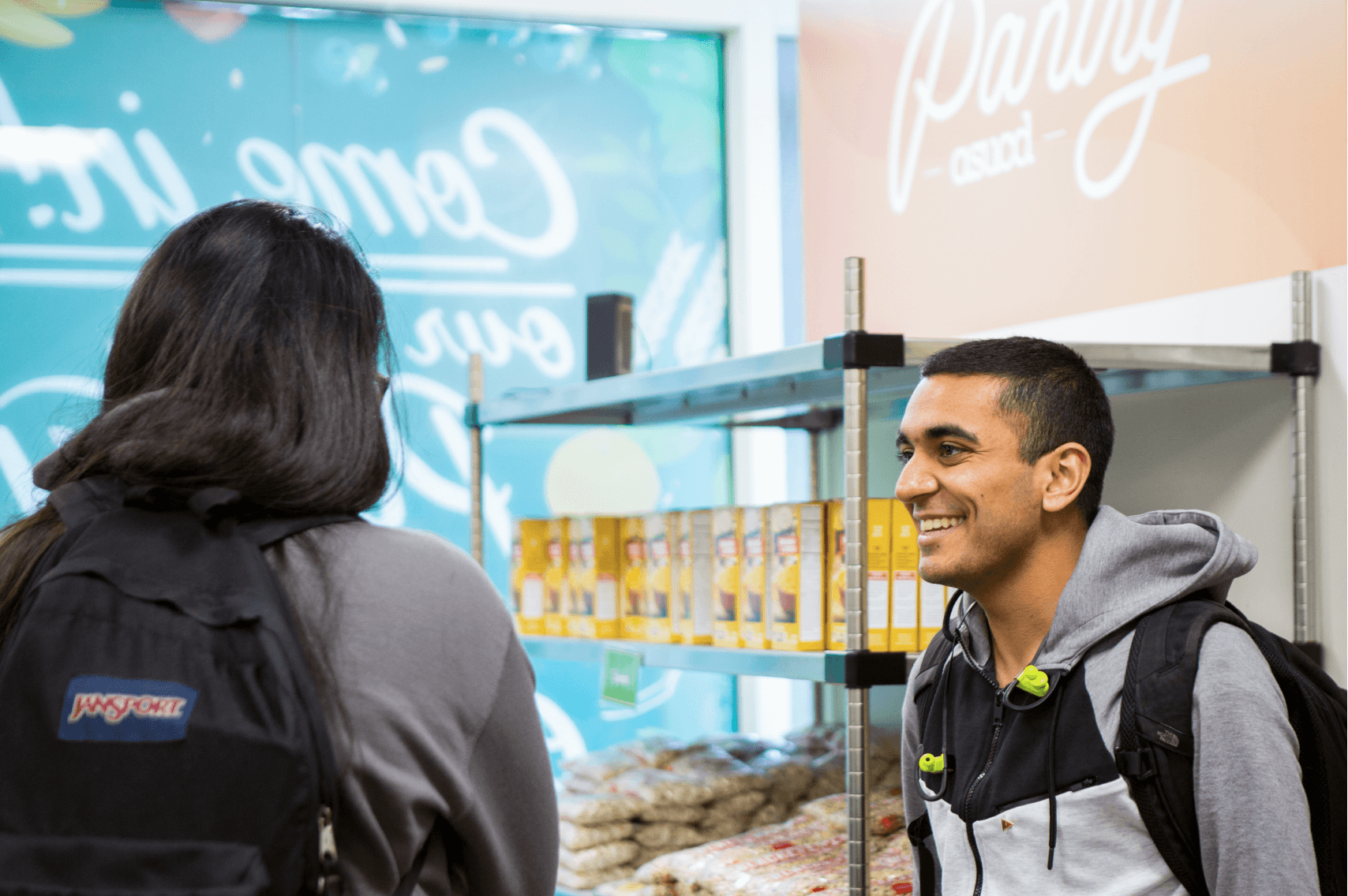
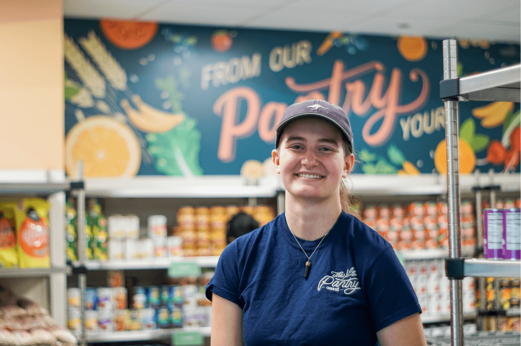
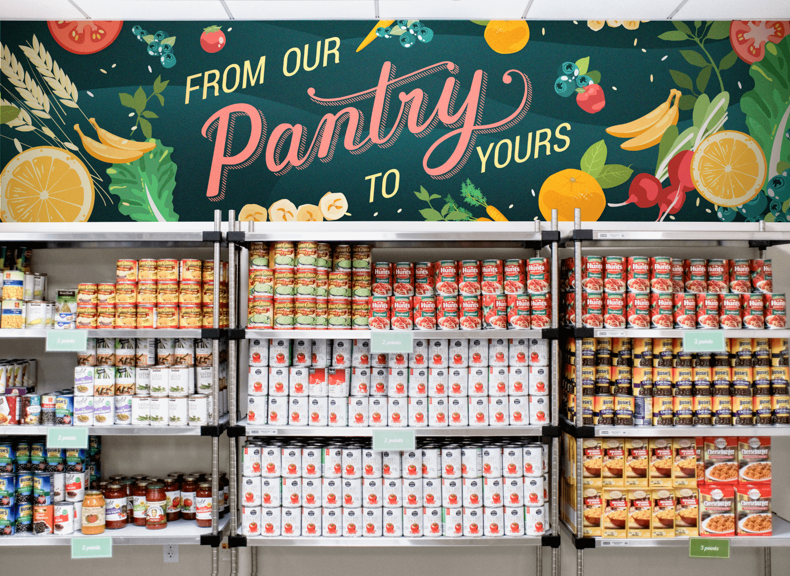
In addition to promotional material, we also added some elements to enhance the experience of the physical space and to tie the atmosphere of The Pantry to the brand aesthetic. The installments made here were created with the intent of lasting long beyond reopening.
Photography © Aggie Studios 2019
Reflection
Every day I walk by The Pantry, I see students coming in and out of the space, even lining up during peak hours just to get their hands on some fresh greens. Being a part of the design team that helped establish the brand, space, and atmosphere of a resource so central to student life is incredibly rewarding.
One difficulty we had was in the sheer amount of materials we produced. Since the scope of the project was up to us, there were many materials we wanted to produce, some beyond what is shown here in my case study. The constant demand for new ideas while staying within the scope of The Pantry’s new visual identity was a constant challenge. We worked the best we could around this by constantly asking for and giving each other feedback, bouncing ideas on different ways to redesign.
All in all, I am very glad to have been part of this team and believe our design work on The Pantry was a huge success. Plus, it’s always fun to tell my friends: “Oh look, I drew that banana.”